Simply put, a good UX means providing users with the relevant information they are looking for in an easy, fast, and direct manner. In short, Google is trying to provide users with the best possible answer to their queries. For this reason, search engines like Google are always looking for ways to create a niftier and more accurate algorithm that can effectively track users’ intent and context to improve search results. To help you better understand UX, here are some criteria to be fulfilled:
1. Page-loading Speed is Crucial
What will happen if your website takes more than 5 seconds to load? Then, 90% of users will leave your website! Hence, page-loading speed is crucial to retain the user’s attention span. Google has great tools such as PageSpeed Insights that helps you measure your website’s load times. Ensuring that your website loads fast at all times enables your website to perform better in search engines while making your users feel more satisfied.
2. Mobile-Friendly Feature is a Must-Have
Nowadays, smartphone users account for 50.44% of the total internet traffic. This means that your website must be mobile responsive, or in layman’s terms, it must be mobile-friendly. So when Google spider crawls your website and notices that your website is lacking in terms of mobile responsiveness or UX, your website’s quality score will drop.
When your webpage loads on a mobile device, you want it to shrink so that users can see all the content on a single-screen display. Pinch zooming to view the full range is a NO-NO as it makes reading the content more of a nuisance than a convenience. Hence, ensure your webpage has a responsive design that works well with all mobile devices.
3. Make Easy Navigation a Priority
A good UX is when users can find the information within three clicks. For example, suppose a user wants to find more information about the specification of your products. In that case, the menu on your website should be clear-cut enough with a well-organized category of products, so it can lead the user directly to the product specification page that the user is looking for.
Observe the actions of users, and look at what might be their next step when they search for information on websites. Then, provide those steps in the most common sequence most users are likely to follow. This helps kill two birds with one stone — your website offers a good UX and content while boosting your search engine ranking performance score!

6 Practical Ways to Enhance Your Website’s UX
1. White Space for A Better Visual Experience
White space is vital for a good web design as your website’s content can be easily read while allowing users to focus on the elements surrounding the text. White space around text and titles helps increase your user’s attention by 20%. In addition, white space offers an open feel while portraying a sleek and contemporary look. If your brand’s characteristics are consistent with such smart and modern design, it can help you communicate that feeling to your target users. However, one shortcoming of white space you should keep in mind is that it takes up space. Striking a balance is the key — place the most important item at the top and surround it with white space to feature the image and/or text.
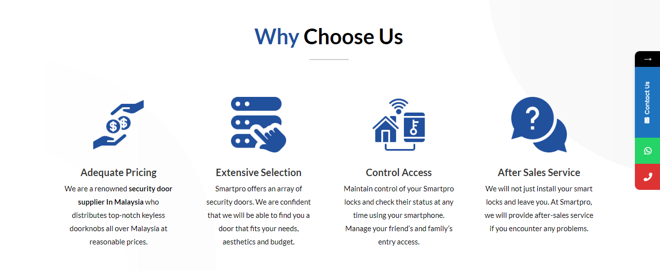
2. Call-to-Action Words that Resonate with Users
Calls-to-action (CTAs) with clear-cut action words help users to navigate your website more efficiently so they can get exactly what they are looking for at the location or page section where they expect to find it. The psychology of color is crucial when you create buttons for your website. First, consider the message you want to evoke for a user (e.g., experience, reliability, etc.) and select your color wisely. Your website buttons should include a verb (an action word) that prompts the user to take immediate action. Hence, the right choices of words that resonate with the user’s emotion will form a connection. For example, “No emotional connection” equals “No action”. Thus, make your words bold and action-oriented with a time limit.

3. Add Hyperlinks that Can Be Easily Identified
Ensure visual cues can quickly identify links added to your website. Underlined text and different colored text help attract user’s attention, highlighting to the user that there is a link to be clicked on. Blue and underlined text are standard links that most users are familiar with; thus, they will click on them if they require further information. Exploiting your user expectations is the key to success.
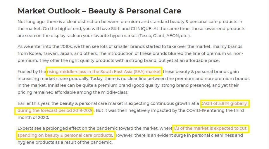
4. Use Bullet Points to Segment Key Information
Bullet points allow users to grasp the information they need quickly (e.g., key features of products/ services, benefits, solutions, etc.) within a short timeframe, making your propositions more attention-grabbing. With plenty of cool icons, try to get creative with your bullet and direct your audience with images representing your point.
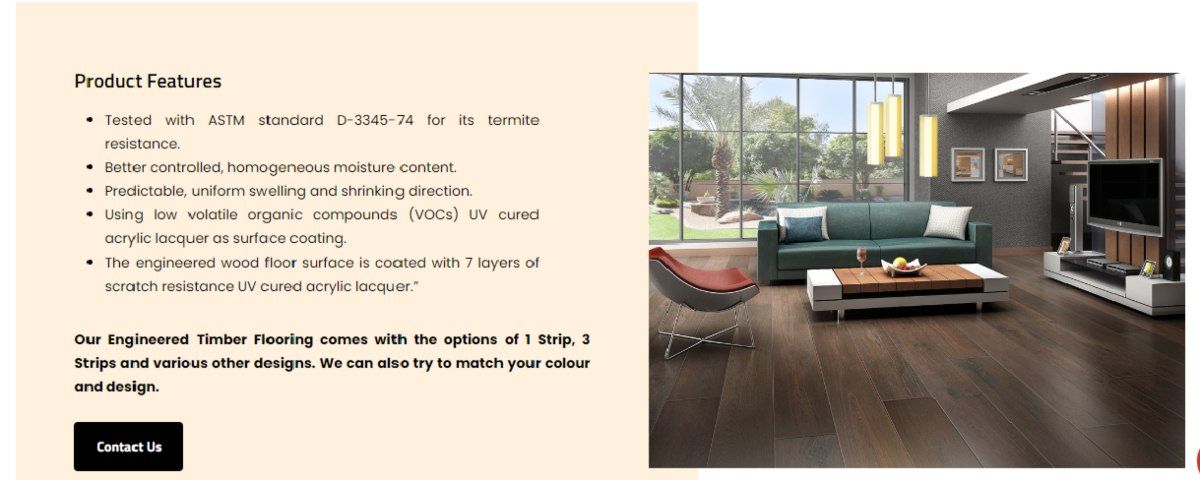
5. Amplify the Visual Impact
“A picture paints a thousand words” — internet users are getting smarter and quicker at assessing company websites before browsing the site further. While fancy stock images may make your web design look good, there’s a catch — using stock images can decrease trust and often be seen as generic and non-unique, and thus, it may fail to create a connection between the user and the brand. Only your images can represent your brand, product, or services. Hence, use images strategically by placing them in areas that support your content which allows the users a visual break from text, but make sure the images are relevant and non-generic.
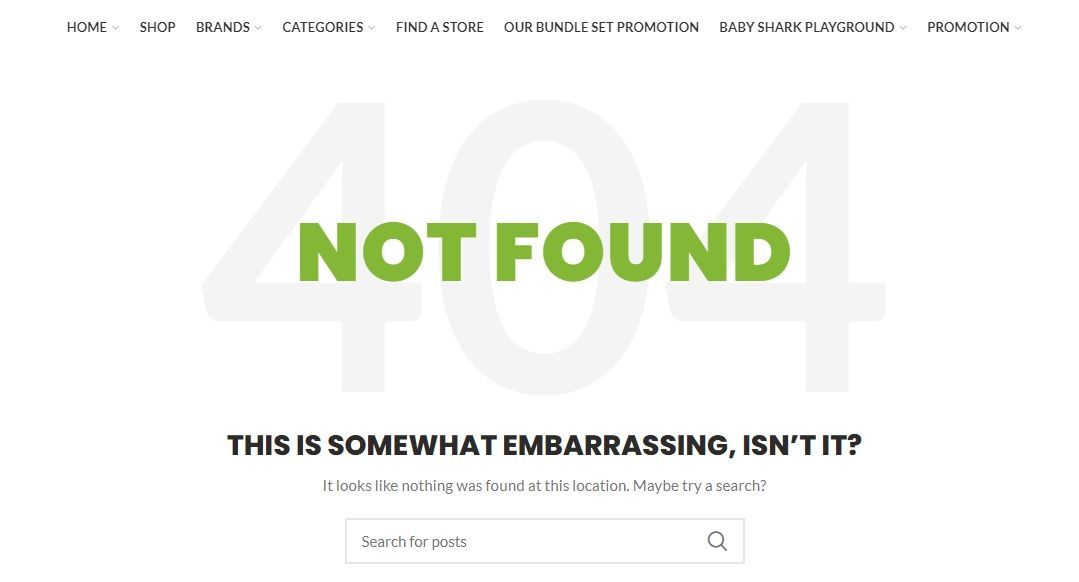
6. Rectify 404 Error Page
In short, encountering a 404 error page upsets your user and most likely make them leave your website as they can browse another website for a faster solution. To track any 404-error page, set up Google Webmaster tools on your website and check crawl errors. Meanwhile, you can give users the option to get back on track when they land on a 404 error page. In addition, when adding hyperlinks, longer link titles are more accessible to be identified than shorter ones (e.g., “To check out the AC Website, click here” vs. “Check out the AC Website here”).
